
Where every brand begins.
The central reference for all brands within the House of Journeys holding.




About House of Journeys
House of Journeys exists to give every sport-and-travel brand in its family the strength of a shared foundation: one platform, one operating standard, one network of partners — built to grow from padel and tennis into any sport, and any experience, that combines passion with a journey. It speaks primarily to the partners, suppliers and investors who help build that foundation with us.
Discovery — every journey starts with a spark of curiosity, and House of Journeys exists to keep supplying it, brand after brand.
Connection — sport, travel and lifestyle converge into one world, powered by a single platform and a single network of partners.
Excellence — every brand under the House of Journeys roof must feel effortless and personal to the people living the experience, and dependable and scalable to the people building it with us.
Passionate — everything we do is built by people who are genuine enthusiasts and experts in their field, our guarantee that we know exactly what we're doing, and love every part of it.
One platform — a single technology and partner network that every vertical is built on, from day one.
Consistent quality — every experience, whatever the sport, meets the same standard of curation and care.
Room to grow — new verticals can launch on proven infrastructure, without starting from zero.
Our Logo
The HJ monogram is the visual anchor of the holding — clean, geometric, versatile. It works as standalone icon, wordmark companion, and badge on sub-brand communications.
Download logo assets

 70mm / print45mm / print25mm / print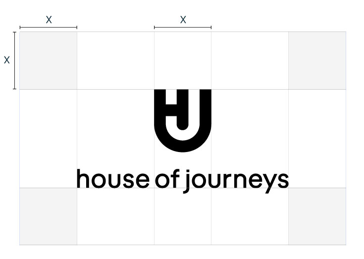




Color Palette
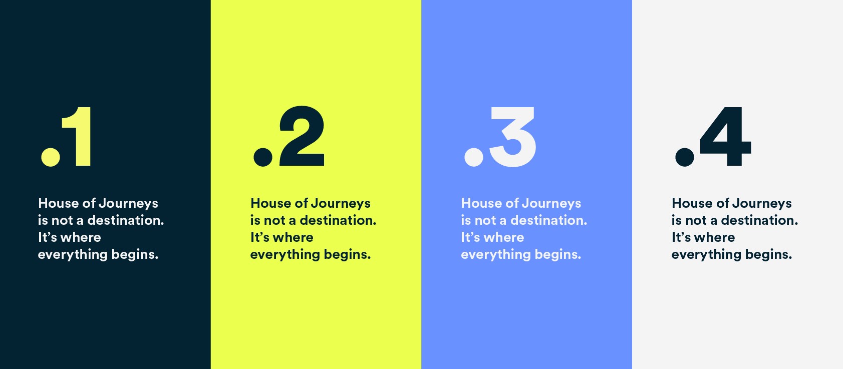
Midnight Dream anchors all communication with authority. Morning Breath adds energy and optimism. Swimming at Sunset and Moon Trail provide range and flexibility.
Download colour swatchesType System
Circular is the voice of House of Journeys — geometric, warm, and confident. Bold for headlines, measured for body copy.
Download fonts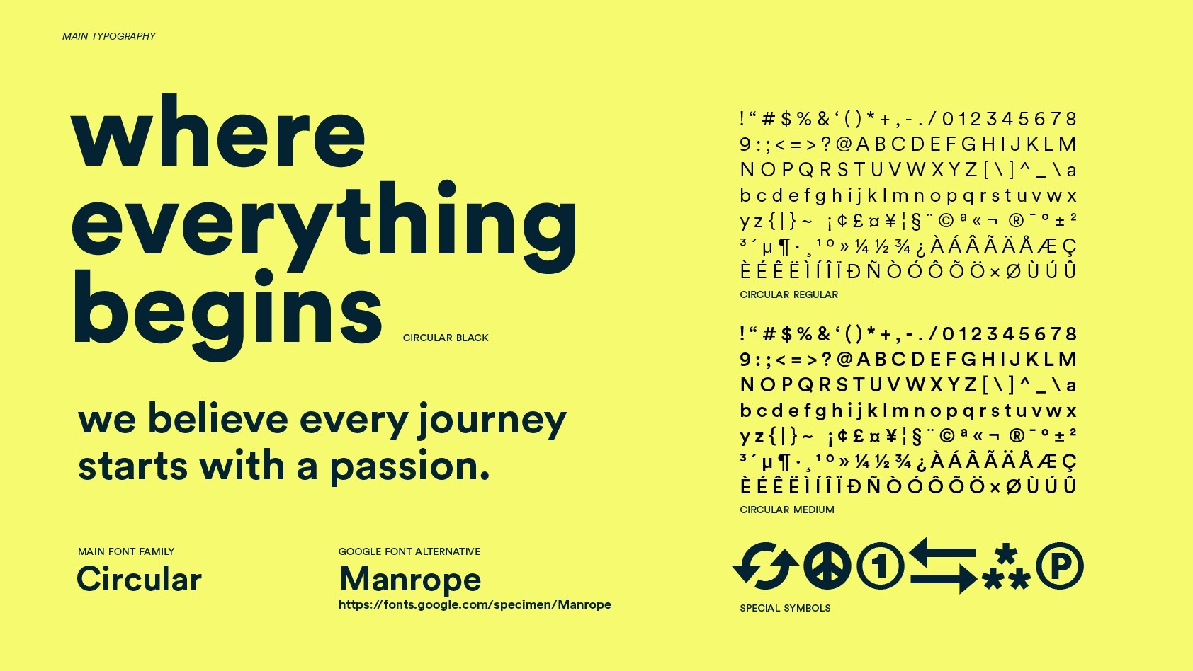
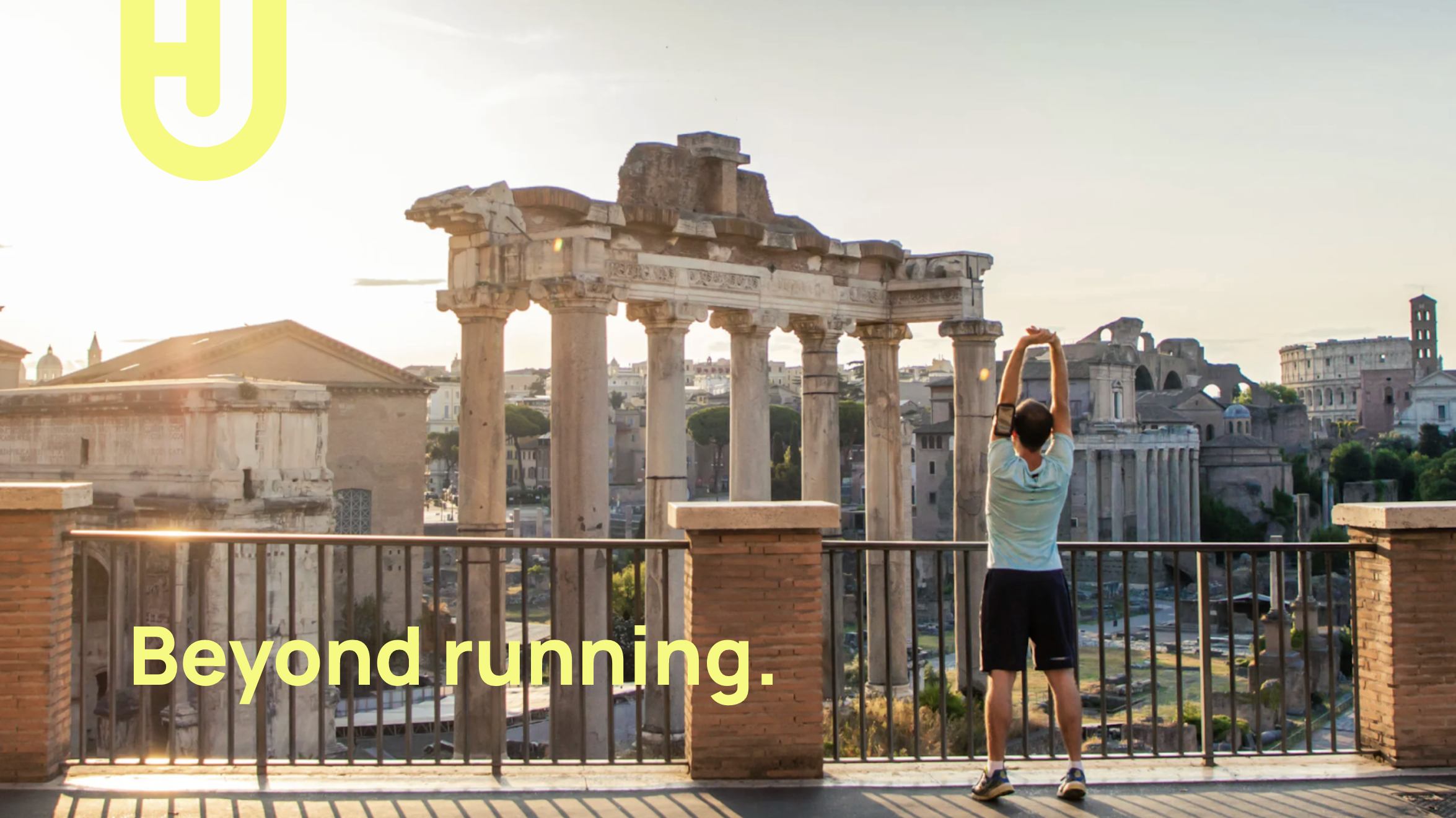
In Frame
A single image that captures the House of Journeys identity in full.

Graphic Elements
A selection of graphic treatments and visual motifs used across House of Journeys communications.



Brand in Use
House of Journeys applied across corporate materials, event signage, and co-branded communications.


Brand Assets
All brand assets are available for authorised use. Use the correct file format for each application.

About weebora
weebora exists to put every padel player one click away from their next trip — from tailor-made holidays to tournaments and training academies, curated by people who know the game. It's the digital home of padel travel: open, inclusive, and built for a community without borders.
Padel. Anytime. Anywhere.
The name weebora phonetically echoes the víbora — one of padel's most spectacular and technical shots, designed to close out the point. Like the víbora, weebora stands for precision, brilliance, and getting straight to the point, efficiently and swiftly.
The "we" speaks to community, teamwork, and the shared moments after a match.
Its dynamic, continuous lettering echoes the bounce and spin of the ball in play.
weebora speaks with an open, rational, constructive, problem-solving and inclusive personality — friendly, welcoming, clear, and confident, never condescending.
It believes in quality, constant improvement, transparency and integrity, and is committed to making padel accessible to the widest possible audience, regardless of background.
Across every channel, on and off the court, weebora speaks with one consistent, unified voice — reflecting its role as an international player in the sport.
Our Logo
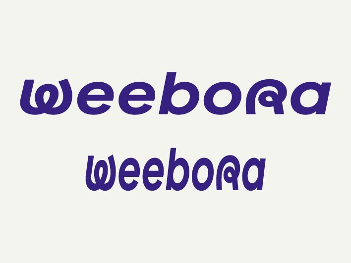
The weebora wordmark is set in Factor A Extrabold, with customised, continuous letterforms that echo the bounce and spin of a padel ball in play. The W icon is the condensed variant for avatars and app icons.
Download logo assets259mm / 980px144mm / 545px85mm / 320px
Color Palette
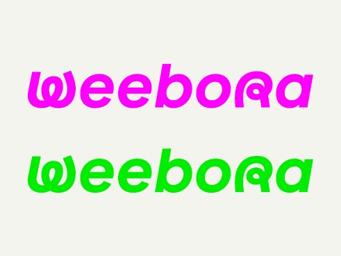
Deep Blue grounds the brand with authority. Coral Red drives urgency and excitement. Caribbean Blue evokes tropical destinations. Lime adds a digital-native burst of energy.
Download colour swatchesType System
Factor A Extrabold is the display typeface — geometric, energetic, unmistakably weebora. Roboto Mono handles body and technical copy.
Download fonts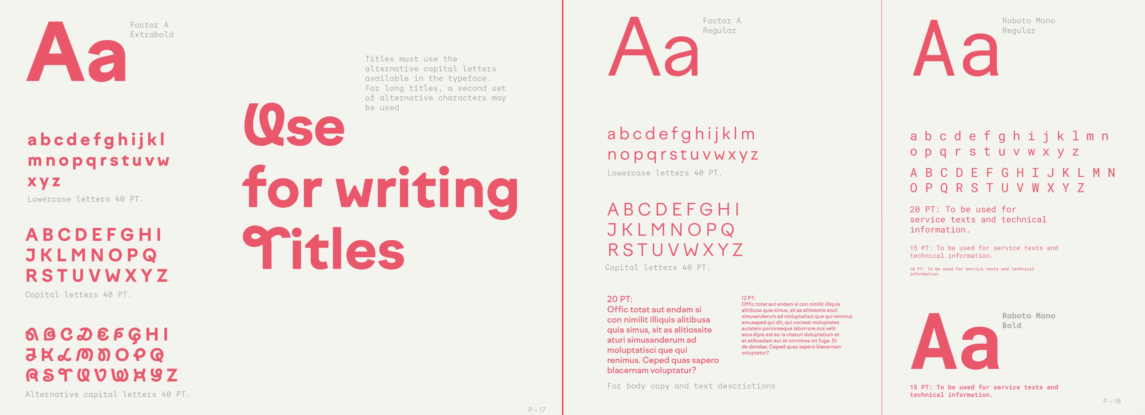
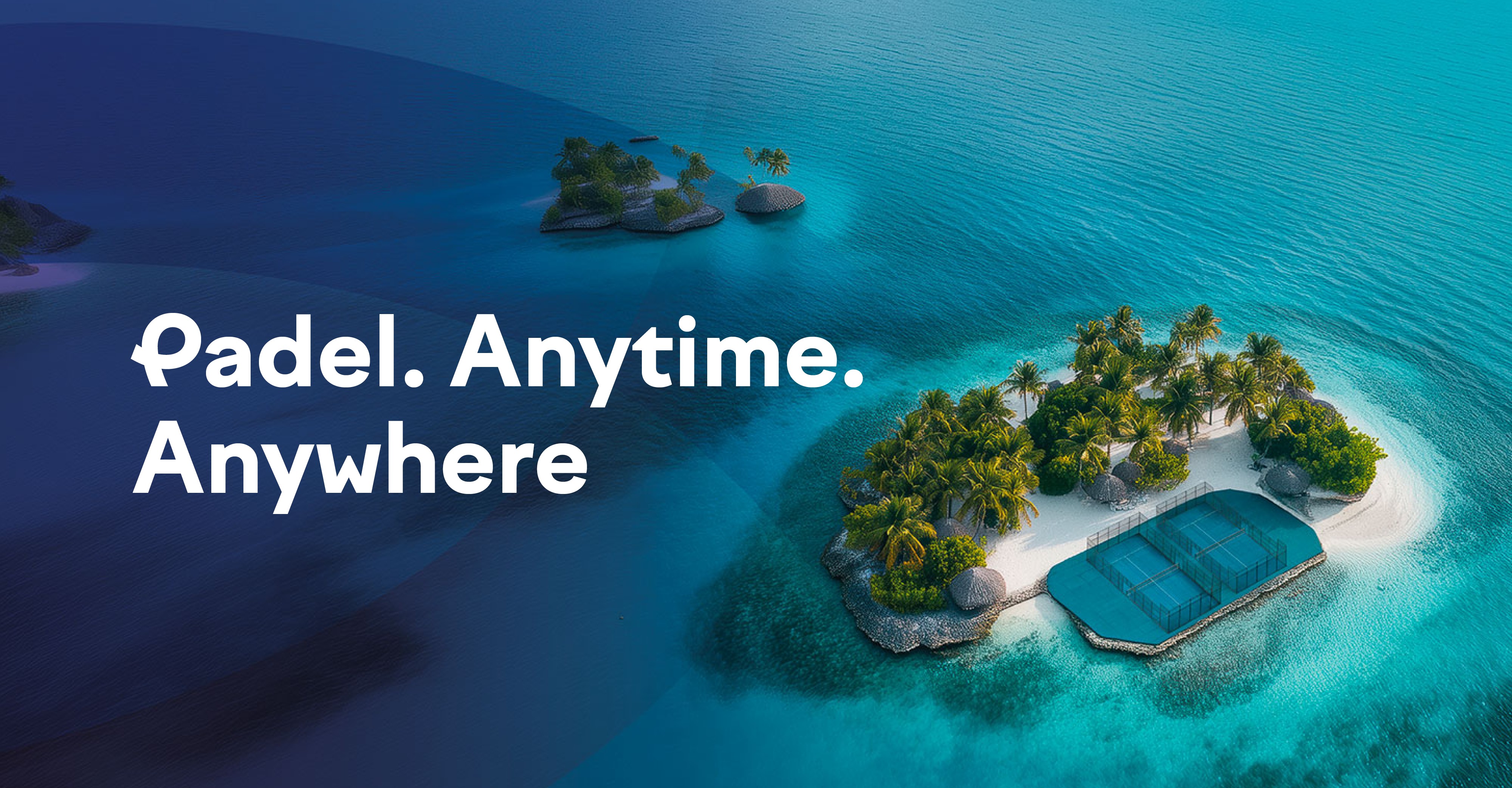
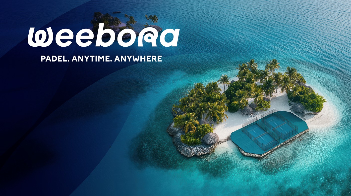
In Frame
A single image that captures the weebora identity in full.
Graphic Elements
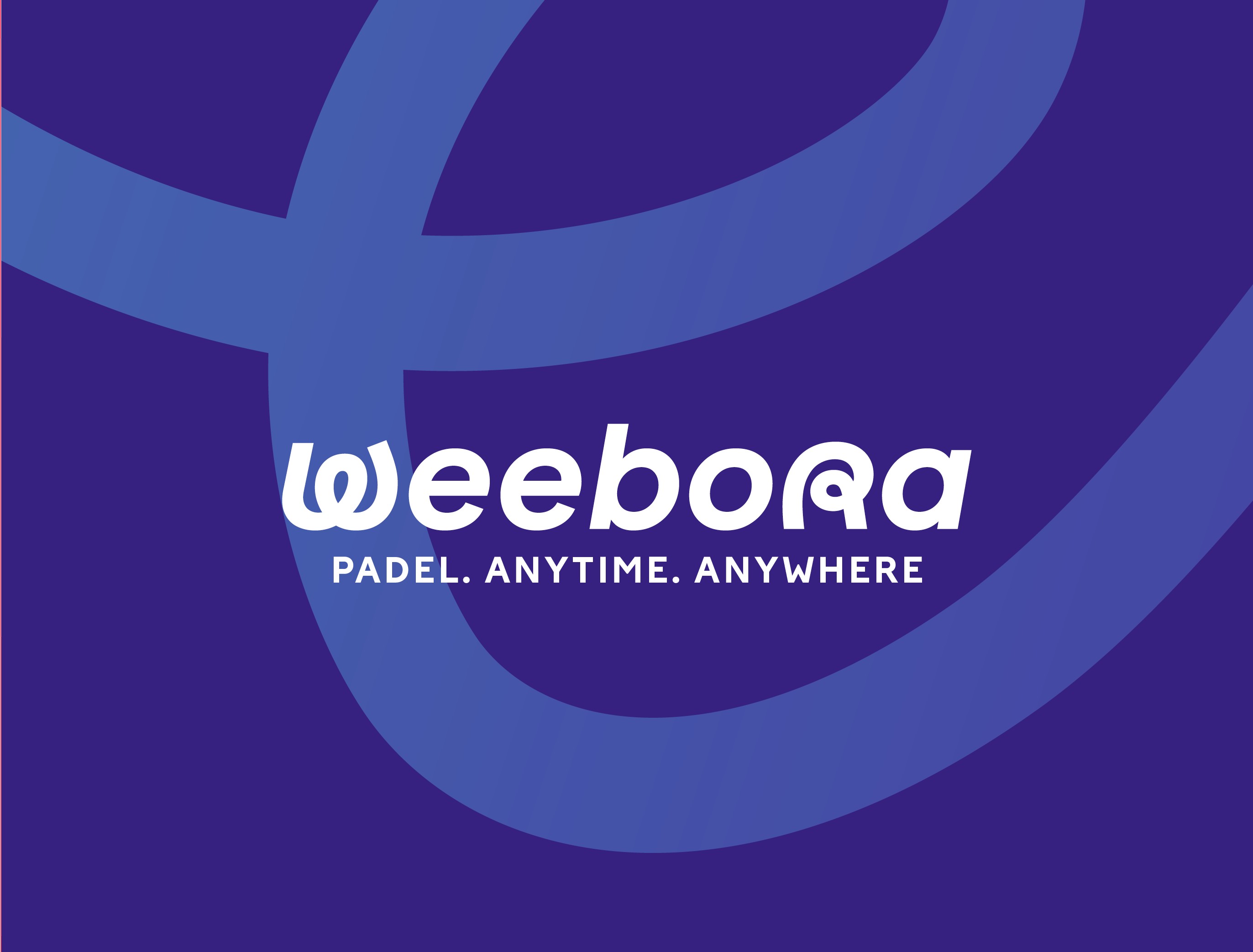
A selection of graphic treatments and visual motifs used across weebora communications.


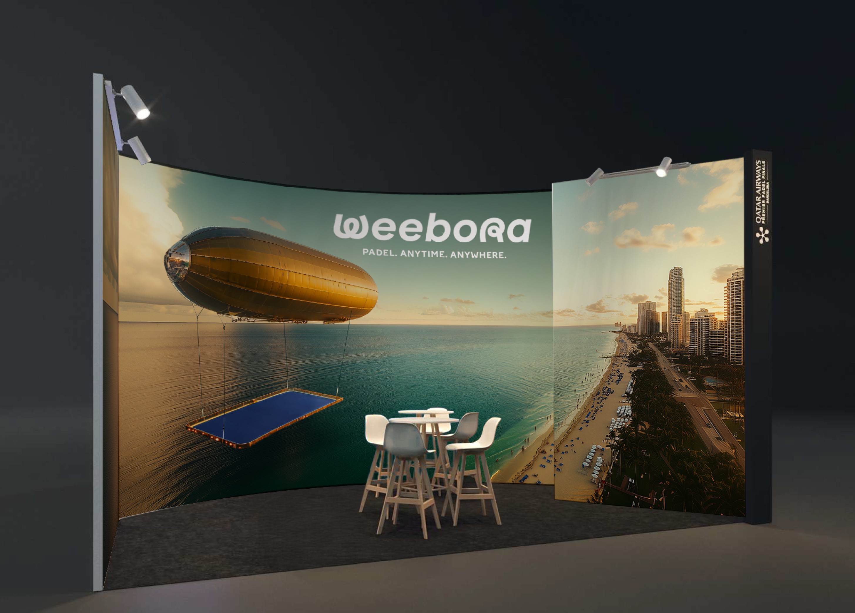
Brand in Use
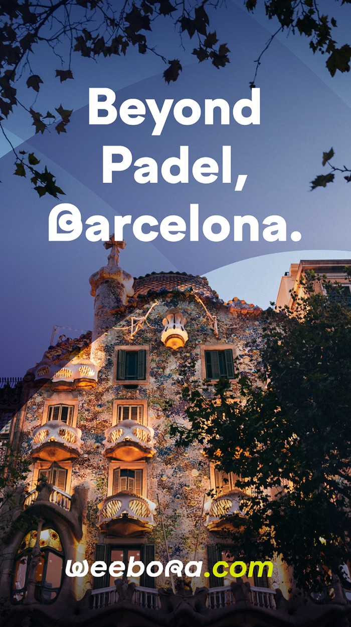
Weebora applied across digital, social, print, and physical brand environments.
Brand Assets
All brand assets are available for authorised use.
About terrarossa
Terrarossa turns a love for tennis into a way of travelling. It brings together the world's best academies, holiday destinations, and tournaments into one curated marketplace — for players training their game, travellers chasing tennis-friendly destinations, and fans wanting to feel Grand Slam intensity live. With Terrarossa, tennis is never just a match: it's the journey around it.
Travel the World of Tennis.
Elegance — terrarossa carries the heritage and elegance of the game: classic yet contemporary, technical without ever feeling exclusive.
Passion — tennis is an obsession. Terrarossa speaks to those who don't just love the sport, they live it — from a first lesson to the finals at Wimbledon.
Access — every academy, every destination, every tournament in the world, curated by people who know the game, gathered in one place.
Travel the World of Tennis. — primary
Serve, Explore, Repeat. — campaign
Tennis without borders. — campaign
Vision — To become the world's reference marketplace for tennis travel, inspiring and connecting a global community of players and fans while giving back to the growth of the sport we love.
Mission — We curate unforgettable tennis journeys, from first serve to centre court, combining expert selection with the ease of a single platform.
Our Logo
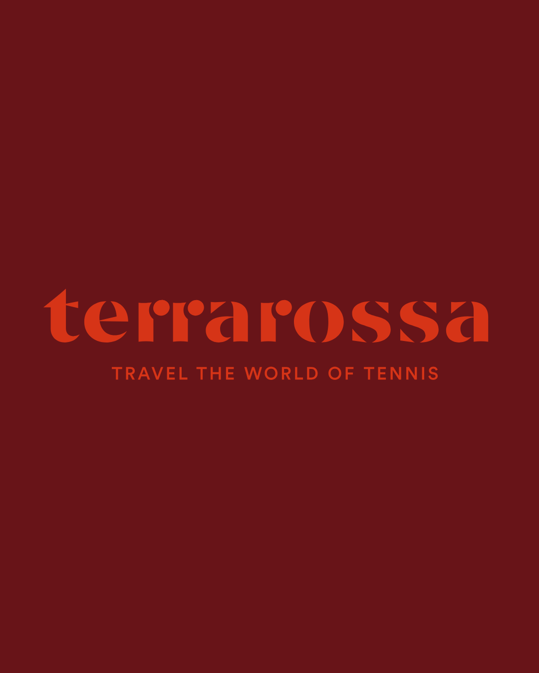
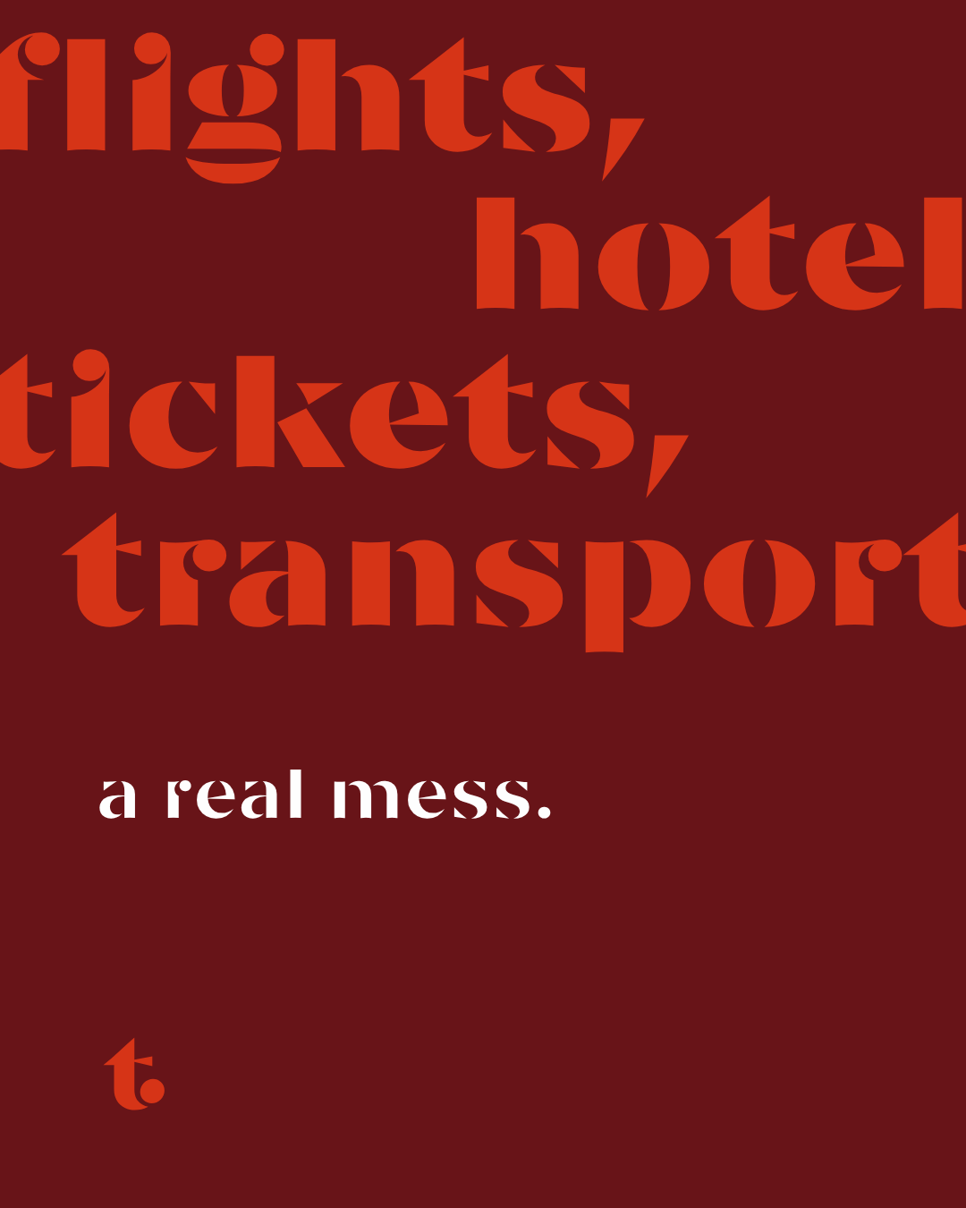
The terrarossa wordmark is set in Prizma Bold — a high-contrast display serif that channels the grandeur of Grand Slam communication while remaining distinctly modern.
Download logo assets 90mm / print60mm / print40mm / print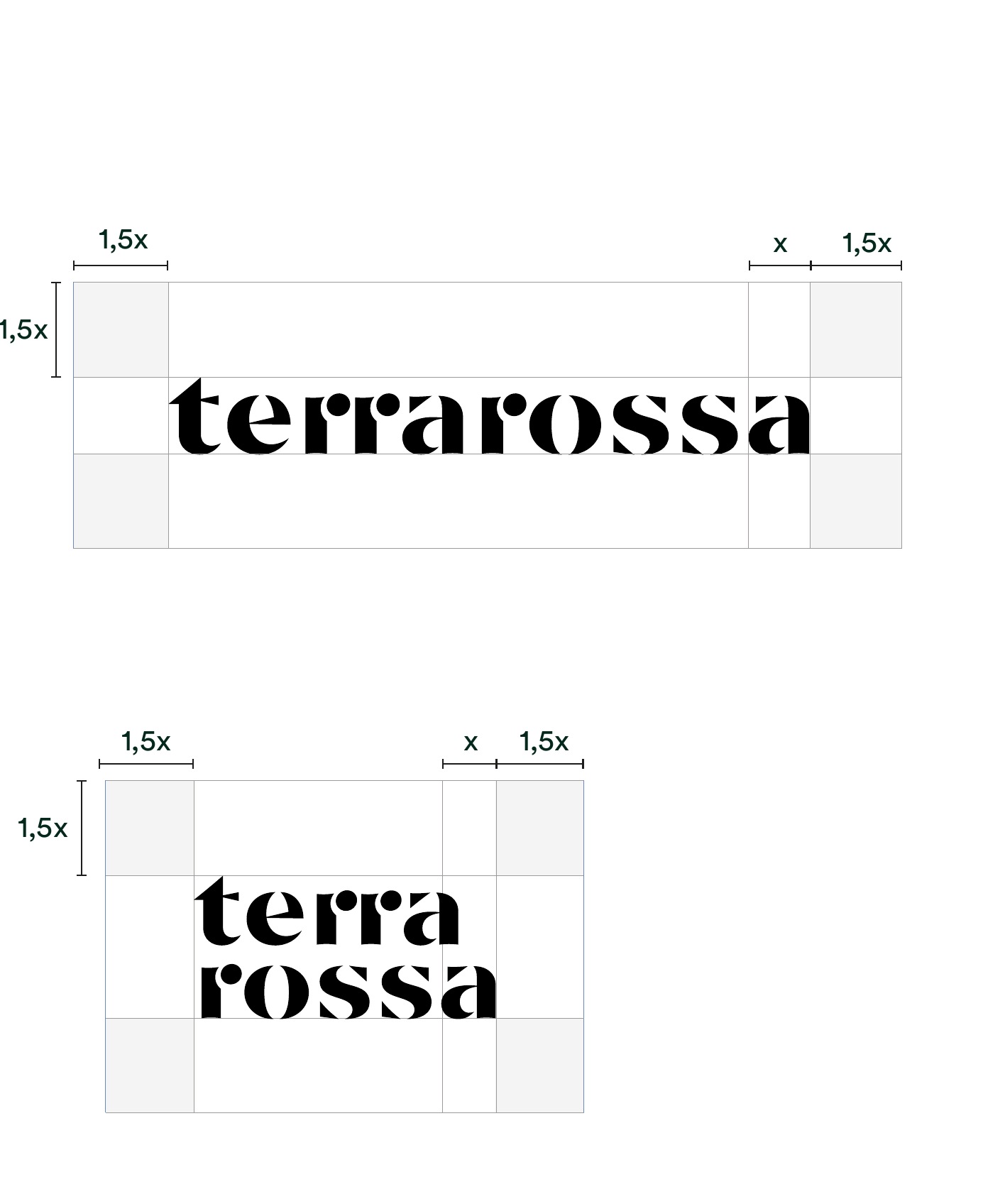
Color Palette
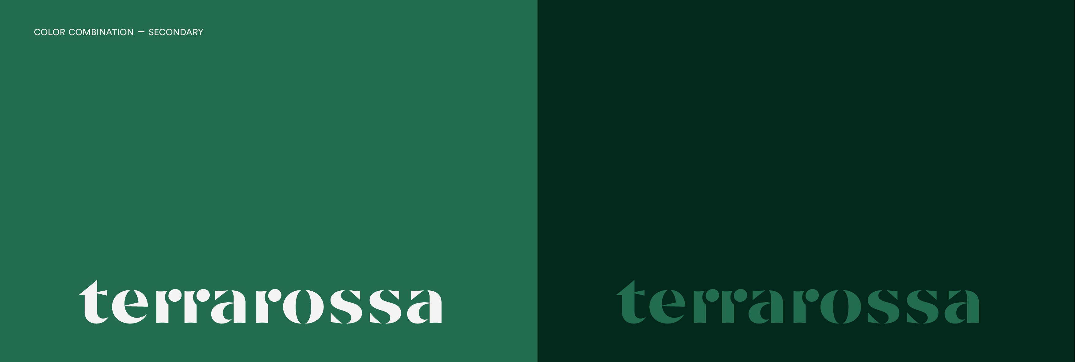
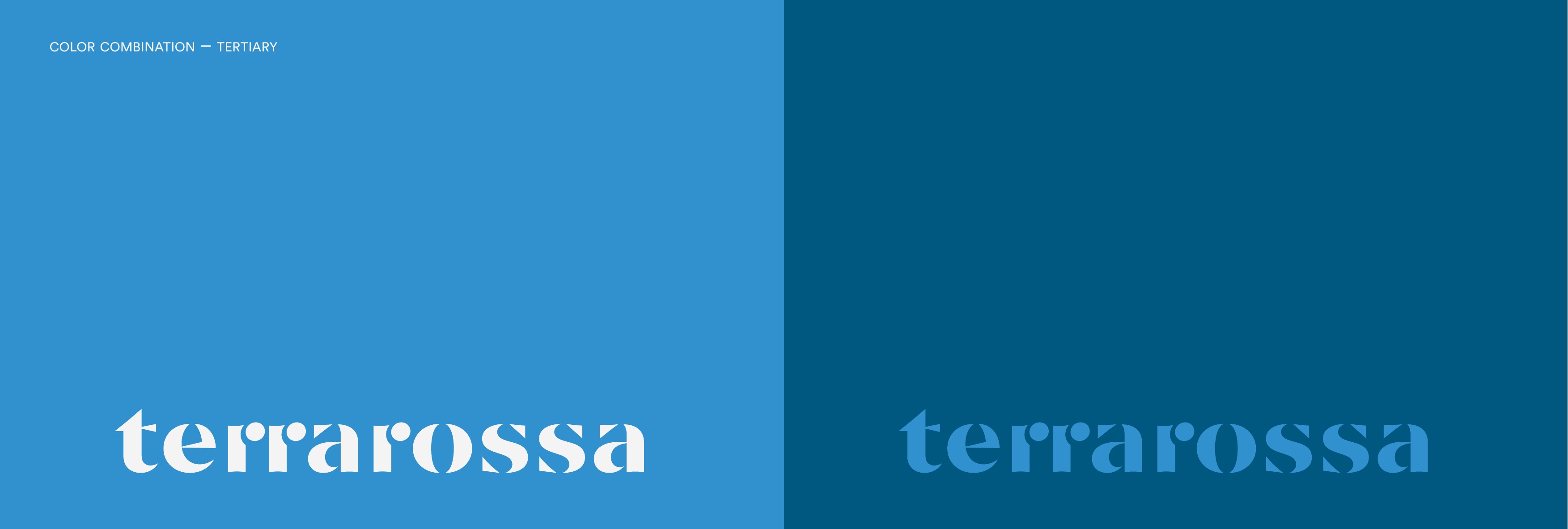
Inspired by the four Grand Slam tournaments. Dark Amaranth and Brilliant Scarlet echo clay. Secondary palettes reference Melbourne's hard courts and Wimbledon's grass.
Download colour swatches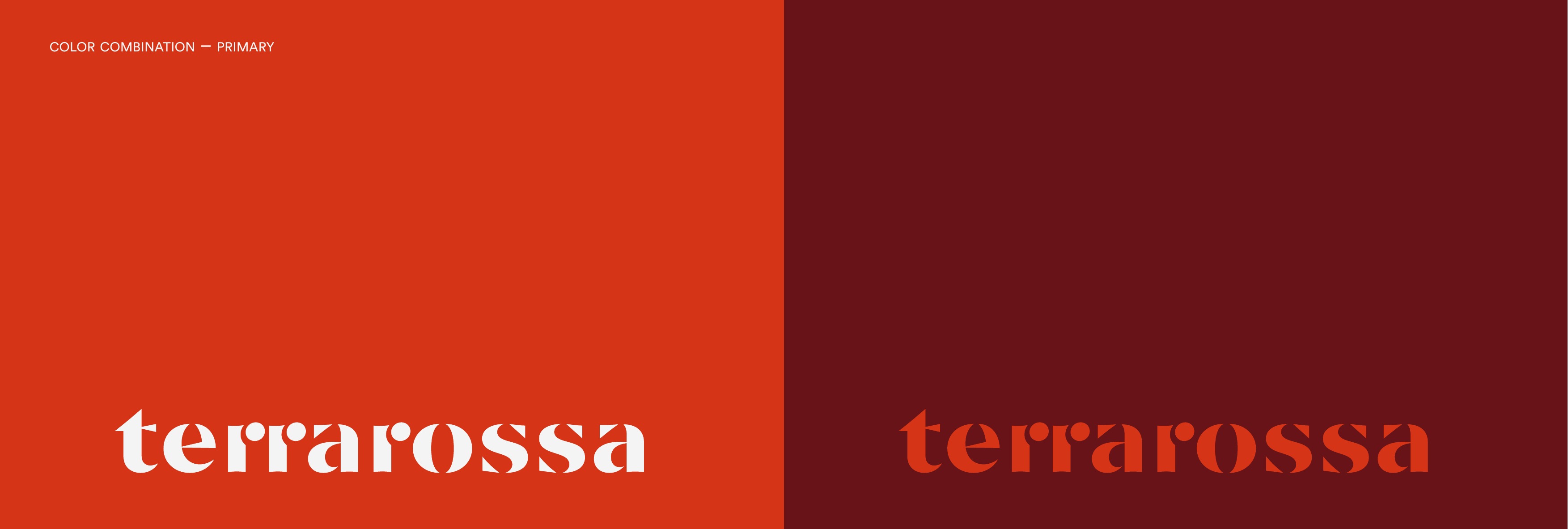
Type System
Prizma Bold is the display typeface — a high-contrast serif with dramatic thick-thin strokes. Circular (or Manrope) handles body copy as a clean, contemporary counterpoint.
Download fonts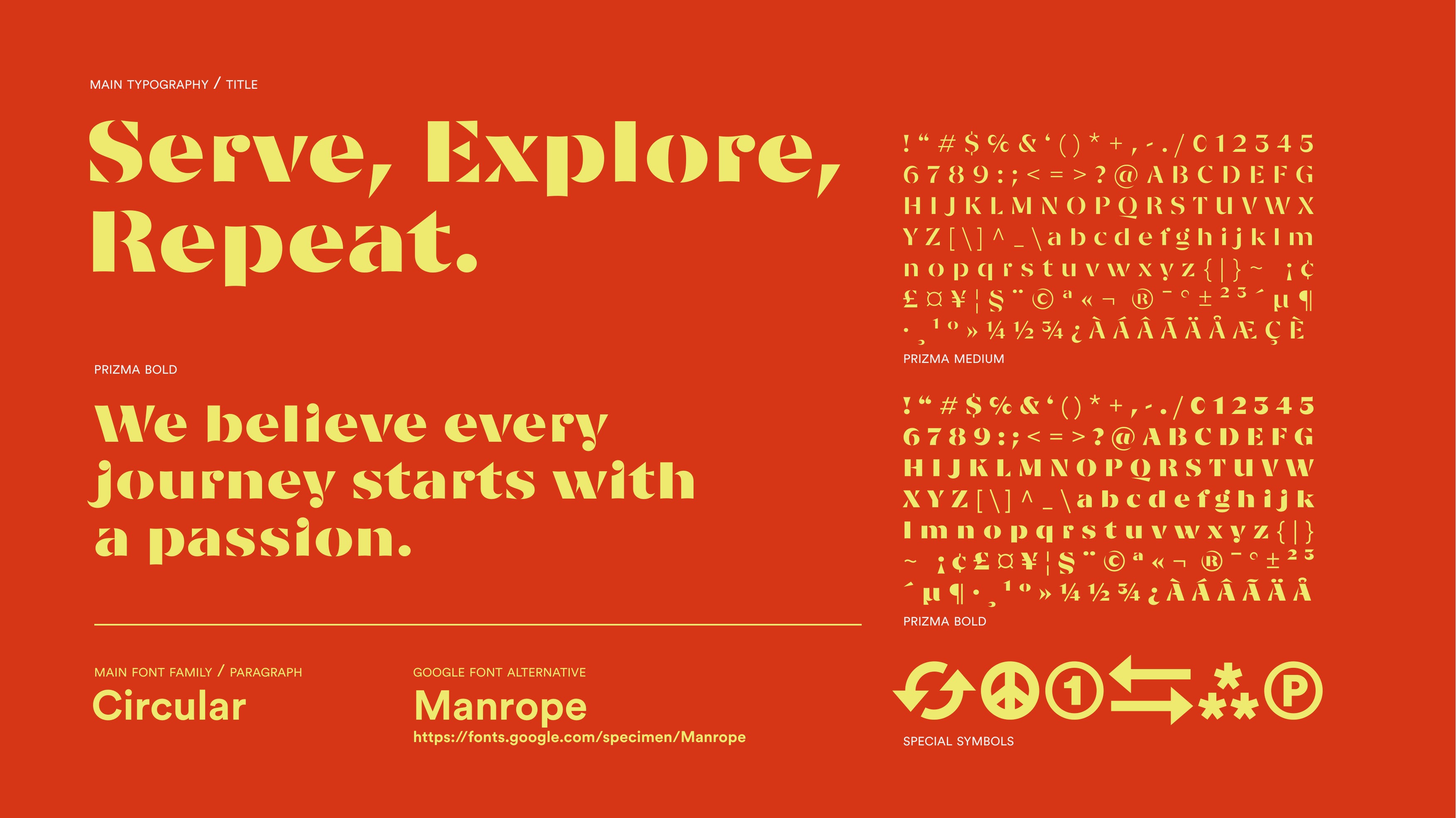
In Frame
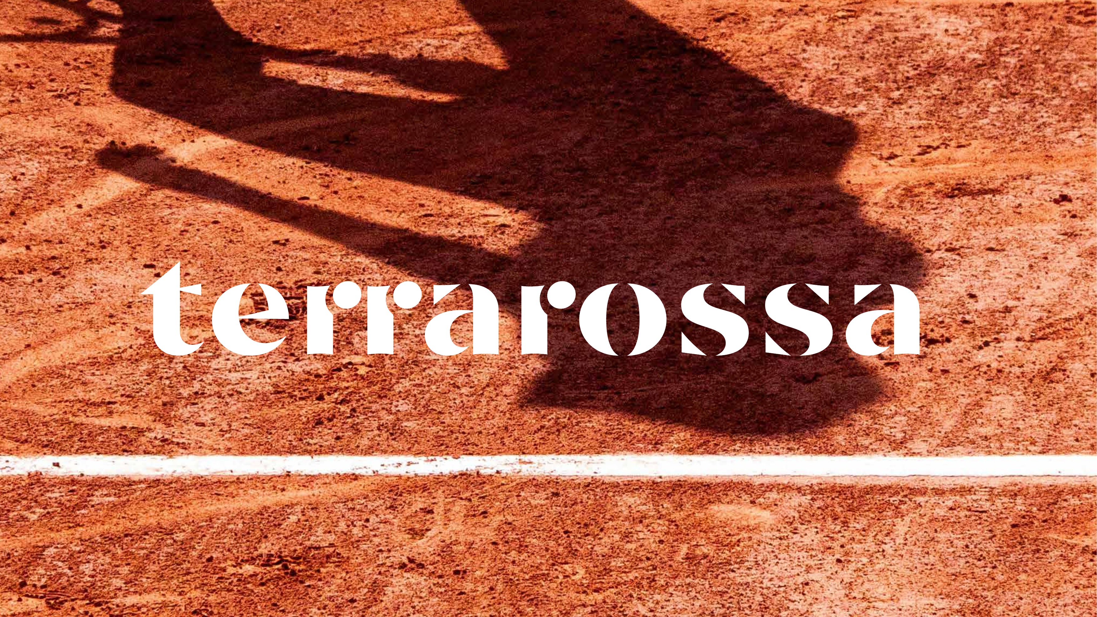
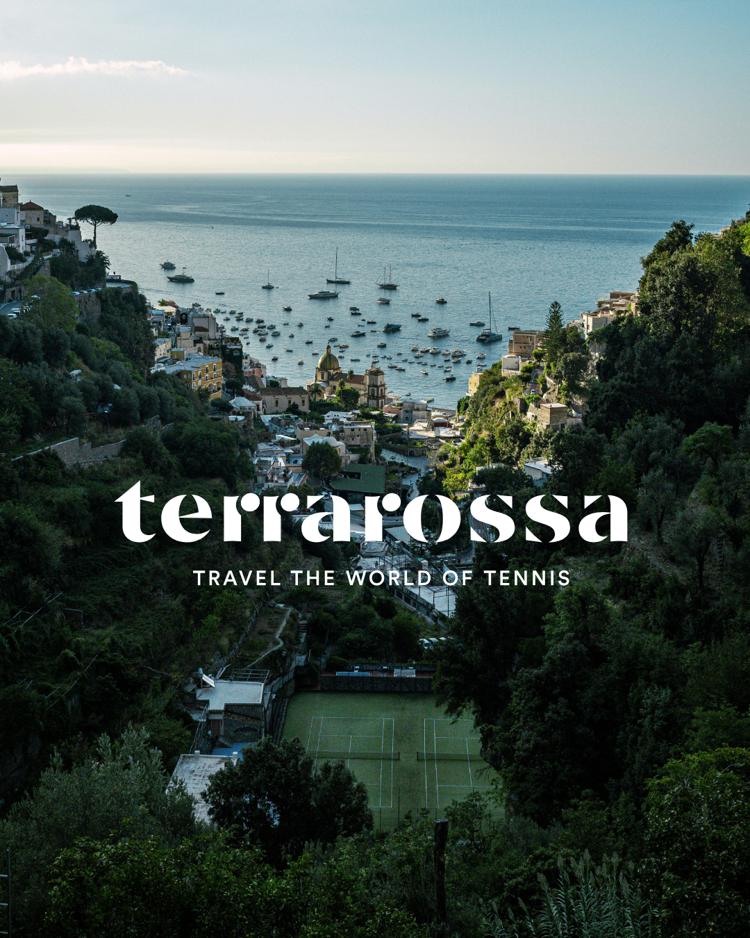
A single image that captures the terrarossa identity in full.
Graphic Elements
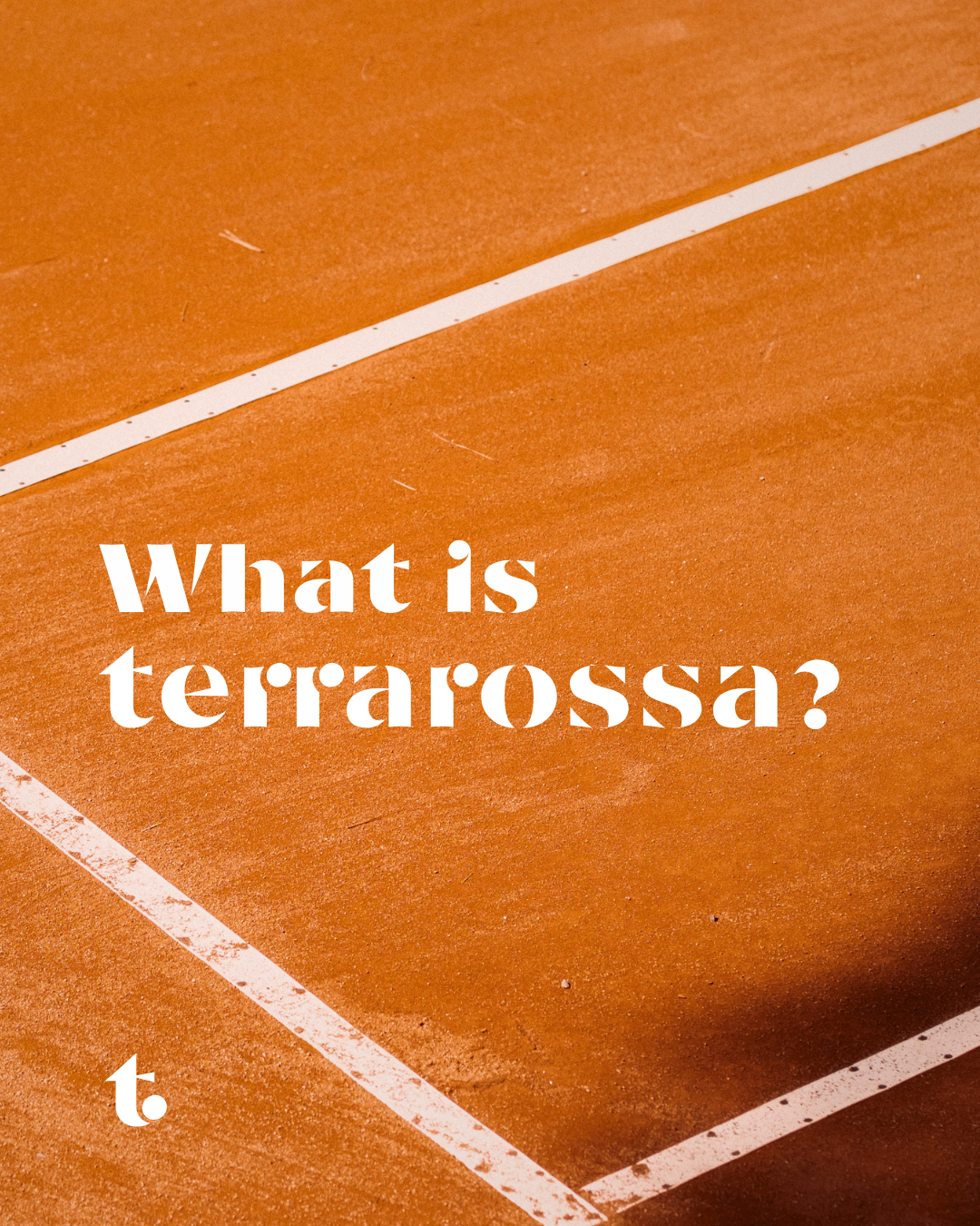
A selection of graphic treatments and visual motifs used across terrarossa communications.

Brand in Use
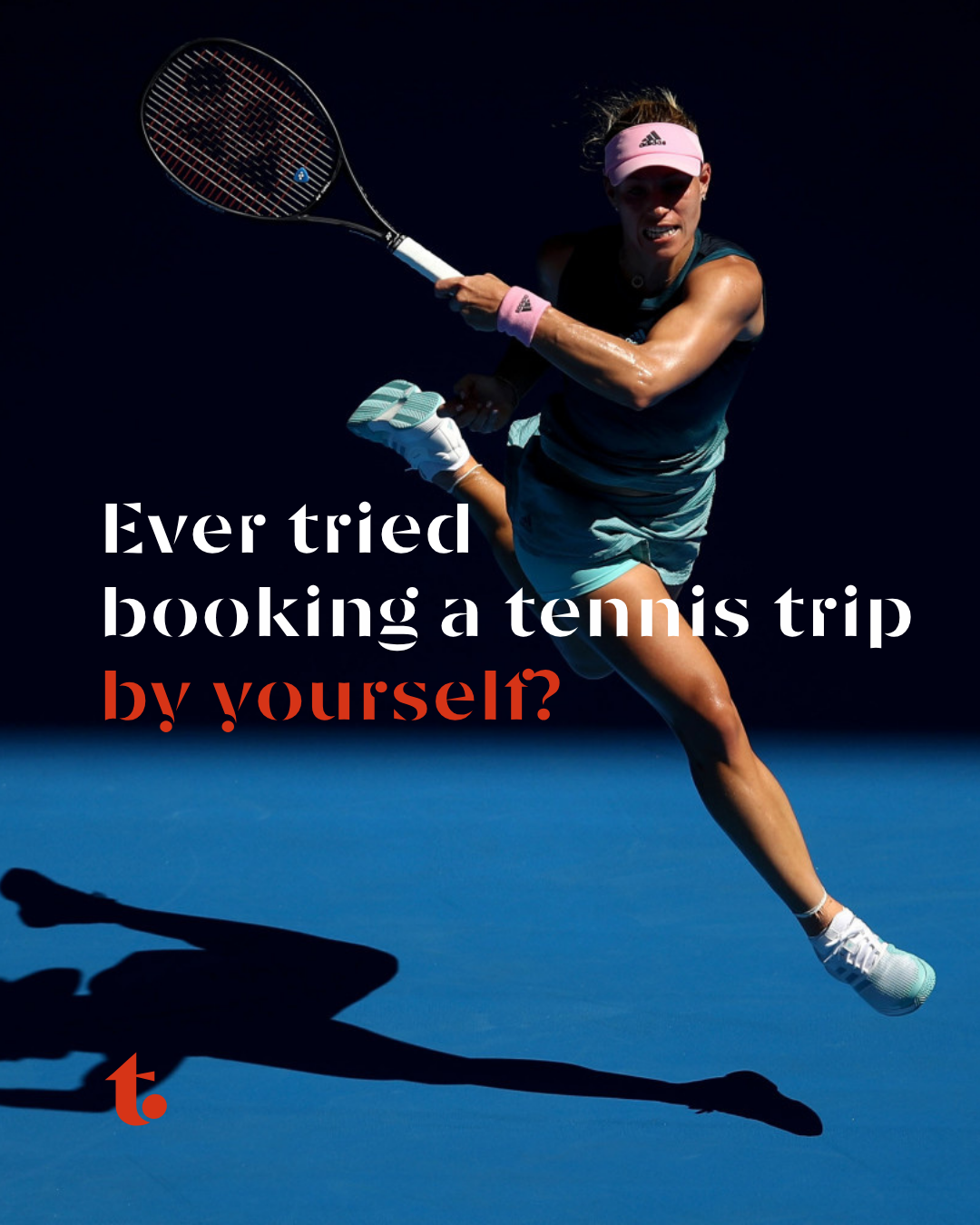
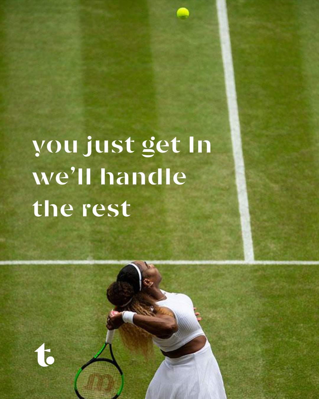
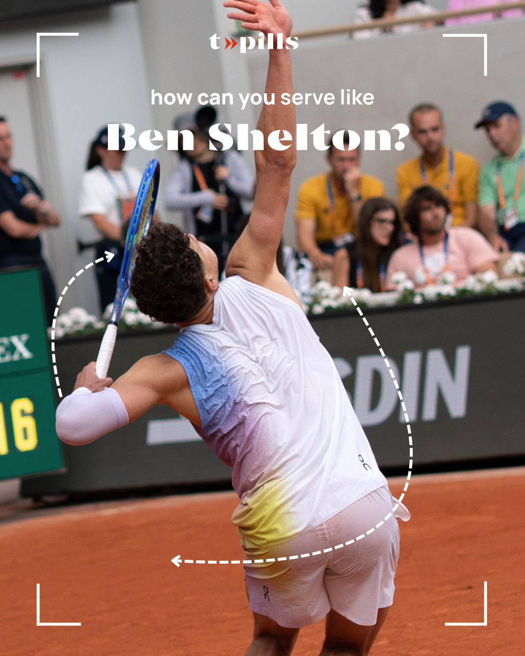
Terrarossa applied across luxury travel, tournament packages, and digital channels.




Brand Assets
All brand assets are available for authorised use.